Introduction
Choosing the proper porcelain tile color for your home can be a life-changing decision. Proper selection enhances aesthetic appeal, along with the total ambiance of the living space. Be it 600x600 or 600x1200 tiles, choosing tile colors that match your home design is one important basis of what you need to know.
The color you choose for porcelain tiles can add much to the appeal of the space you are designing. Chosen well, tile color can create a roomy, cozy, or vibrant feeling in a room. If you carefully consider the room size, lighting, and current decor in your home, you will get tile colors that will ultimately complement your house's style.
Understanding Porcelain Tiles
Porcelain tiles have found a high use in home design due to their strength and aesthetic appeal. The tiles are more concentrated in clay than the average ceramic tiles, and also fired at a higher temperature. That automatically makes them more resistant to moisture, stains, and wear.

Types of Porcelain Tiles
There exist various types of porcelain tiles for various design needs:
-
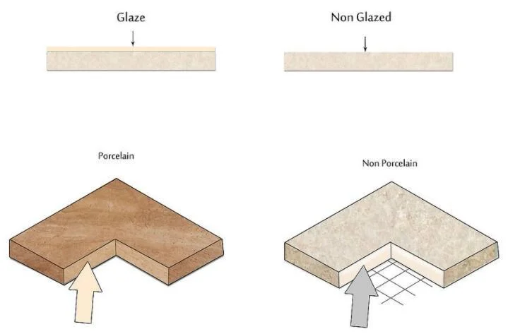
Glazed Porcelain Tiles: These usually have a glass-like coating which could be either glossy or matte.
-
Unglazed Porcelain Tiles: they are naturally finished and non-reflective in style;
-
Through-Body Porcelain Tiles: they reveal the same color and pattern on every part of the tile, and that is why they can be used in high-traffic areas.
How to Choose Between Glazed and Unglazed Porcelain Tiles
When one is in the process of choosing between glazed and unglazed porcelain tiles, the place where the tile will be used and the style to be achieved will be great determining factors. This blog offers an insight into this decision.
Benefits of Porcelain Tile
Some of the advantages that come with using porcelain tiles in home design include the following:
-
Durability, highly resistant to scratches and heavy traffic of people
-
Low maintenance, easy to clean
-
Versatility, available in many colors, patterns, and finishes
Such characteristics make porcelain tile an excellent choice as far as aesthetic value and practicality are concerned.
Factors Influencing Tile Color Selection
Room size influences tile color in many ways. For lighter shades of color, the feeling of spaciousness is created in smaller-sized rooms.
The light-colored tile in white or soft gray reflects light and creates an illusion of expansion. Then again, darker-colored tiles in deep blues or charcoal make large areas much cozier and friendlier.
The color of the tile also makes much difference, especially the natural light in a room. Dark tiles will not be so heavy and overwhelming in brighter rooms since they receive good sunlight. On the other hand, in those places that have poor natural lighting, it is best to go with lighter-coloured tiles since this lights up the area, therefore making them never dingy and claustrophobic.
All these will help you understand which factors come into play and enable you to choose a tile color in harmony with the unique characteristics of your home.
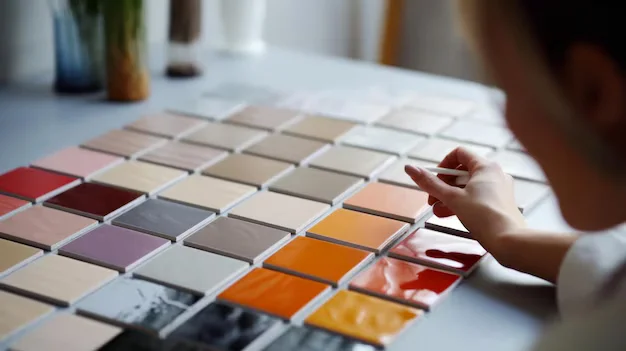
Exploring Tile Color Options for Your Space
Neutral colors often provide the backbone for interior design, bringing versatility and timeless appeal along with them. Beige, gray, taupe-the shades go on and can blend rather effortlessly with a great many styles: modern, rustic, traditional.
Neutral colors serve to provide a clean canvas where one can play with other design elements like furniture and decor without overwhelming the space. Their understated elegance provides calmness and continuity in your home.
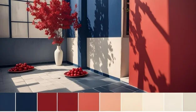
On the other hand, bold colors bring character and life to a room. Deep blues, blazing reds, or emerald greens can be focal pieces commanding attention and eliciting interest towards that part of the room. So that the room may not be overpowered with bold colors :
-
Use bold colors only in small doses: Apply them on less broader sections or as accents.
-
Balance bold tiles with neutral-colored walls and furniture: this also helps maintain harmony within the room.
-
Consider the function of the room: Bold colors are fabulous for rooms intended for entertaining or even creativity, but overstimulating for sleeping or study areas.
You will create a lively and harmonious effect while keeping your personal style if you balance neutral colors with bold colors thoughtfully.
Practical Considerations for Tile Color Selection
Maintenance Differences Between Light and Dark Tiles
The choice between lDark and light porcelain tiles arises in terms of maintenance:
-
Light-colored tiles: These tiles create the appearance of a greater area in any room or space, but dirt, dust, and stains will be much more visible. The possible effect may be to clean them more frequently to keep them looking at their best.
-
Dark-colored tile: These tend to mask dirt and stains a little better, therefore showing less apparent wear. Still, they may show lighter debris like dust or pet hair.
Both have certain advantages, depending on your needs for maintenance or lifestyle.
Recommendations for High-Traffic Areas
With that in mind, here are tips for tile color options in high-traffic areas:
-
Durability: Darker-colored or patterned tiles are proposed to mask the effects of heavy usage, typically in entry, kitchen, and living areas.
-
Cleaning Requirements: The finish on the tile should offer ease of cleaning. Though matt finish may not show fingerprints or smudges quite as easily, the cleaning methods may be different than with the glossy tile choice.
In high-traffic areas, a balance between aesthetics and function will ensure satisfaction in the long term about your tile choice.
Enhancing Aesthetics with Contrasting Colors and Mood Setting Tiles
The Power of Contrasting Tile Colors
The contrast in the tile color can make all the difference in visual appearance and depth of design in your room. Dark-colored floor tiles can be combined with light-hued wall tiles to create a dramatic effect of balance in the dimensions of the room. This not only creates a contrast in visual appeal but also separates the space within one room, or what would have otherwise appeared as an undistinguished compartmental space.
Setting the Mood with Tile Colors
Different tile colors can set the mood and atmosphere of a room.
On one hand, warm colors like reds or oranges provide a very warm and cozy atmosphere; thus, these are ideal colors for a living room or even a dining room. In fact, there has been a significant trend toward the return of warm colors into interior design, which adds coziness and vibrant excitement to spaces.
On the other hand, cool tones include blues and greens that evoke feelings of relaxation and calmness, hence very appropriate for bathrooms and bedrooms.
Creating Your Perfect Space
This balance can completely alter the feel of a room, from what you are trying to achieve with it to what you want based on your personal preference.
Coordinating Porcelain Tiles with Existing Decor and Current Trends
Matching tile color with the other elements in your home is an essential action for harmony in design. Consider how the tile will interact with:
-
Wall Paint: It should blend with the color of your wall paint. To give your place a modern look, you can use light gray tiles with dark blue-colored walls.
-
Colors of Furniture: Make sure that the color complementarities of your furniture pieces run in harmony with the colors of the tiles in your kitchen. Wooden furniture would do well with neutral colored tiles, while bolder furniture and other accessories would look good in less boisterous tile colors.
A color wheel will help in identifying complementary colors that can help one achieve a balanced visual flow. Keeping updated about current trends, like natural stone finishes or wood-look porcelain tiles, helps in making choices that will be modern yet timeless.
Installation Considerations for Porcelain Tile Colors Selection Process
Knowledge of how various installation techniques can affect the apparent color of tiles is important. For example, grout color is a huge factor; contrasting grout can really make the definition of shapes in the tiles and thereby create a patterned effect, while matching will make a clean seam look good.
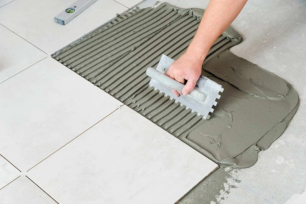
Some Tips for Proper Installation Planning:
-
Lighting Tests: Place your tile samples under the lighting conditions within your house and observe color changes.
-
Grout Selection: Choose such grout colors that will complement the color of the tile or contrast with it, depending on your desired overall look.
-
Layout Patterns: Try different layout patterns-skewed, herringbone, staggered-and others to determine which will make the tile look best.
By paying attention to proper installation, one will be assured of achieving a perfect look of the area.
FAQs (Frequently Asked Questions)
1. What are porcelain tiles and what are their benefits?
Porcelain tiles are a type of ceramic tile made from dense clay and fired at high temperatures, resulting in a durable and water-resistant material. The benefits of using porcelain tiles include their low maintenance requirements, resistance to stains and moisture, and versatility in design, making them suitable for various home environments.
2. How does room size affect the selection of porcelain tile color?
Room size can significantly impact color perception; larger rooms may benefit from darker or bolder colors to create a cozy atmosphere, while smaller spaces often look better with lighter or neutral colors to enhance the feeling of spaciousness.
3. What role does natural light play in choosing tile color?
Natural light affects how colors appear in a space. Rooms with ample natural light can handle darker or more vibrant tile colors without feeling cramped, whereas areas with limited light may require lighter shades to avoid a dull appearance.
4. How can I incorporate bold colors into my tile selection without overwhelming the space?
To incorporate bold colors effectively, consider using them as accents rather than dominant features. Pair bold tiles with neutral tones for balance, or use them in smaller areas like backsplashes or borders to add interest without overpowering the overall design.
5. What maintenance considerations should I keep in mind when selecting tile colors?
Maintenance varies between light and dark tiles; lighter tiles may show dirt and stains more easily, requiring more frequent cleaning, while darker tiles can hide imperfections but may show dust. It's important to choose colors that align with your lifestyle and cleaning preferences, especially in high-traffic areas.
6. How can I ensure my porcelain tile colors coordinate with my existing decor?
To achieve color coordination, consider the existing elements in your home such as wall paint, furniture, and fixtures. Choose tile colors that complement these elements while also reflecting current design trends to create a cohesive aesthetic throughout your space.

 Live Photos & Videos